
A year of world-wide weather on your wall

The closer a temperature line is positioned to the center of a circle, the colder the minimum temperature of the day. The further out, the warmer the daily maximum temperature. The color represents the daily mean temperature.

Precipitation (rain or snow) is represented as blue circle, representing the amount (more rain = bigger circle). Rain circles are placed on the center of the day’s temperature line.

A Weather Radial consists of 365 lines; one for each day of the year. The first is January 1 at the top (12 o’clock), days continue clockwise.
The cities in detail

Reykjavík, Iceland

Oslo, Norway

Stockholm, Sweden

Helsinki, Finnland

London, United Kingdom

Amsterdam, The Netherlands

Berlin, Germany

Warsaw, Poland

Moscow, Russian Federation

Madrid, Spain

Paris, France

Rome, Italy

Istanbul, Turkey

Tel Aviv, Israel

Mumbai, India

Hong Kong, China

Beijing, China

Seoul, South Korea

Tokyo, Japan

Seattle, USA

Chicago, USA

Toronto, Canada

Washington, D.C., USA

New York City, USA

San Francisco, USA

Los Angeles, USA

Mexico City, Mexico

Austin, USA

Miami, USA

Buenos Aires, Argentina

São Paulo, Brazil

Cairo, Egypt

Johannesburg, South Africa
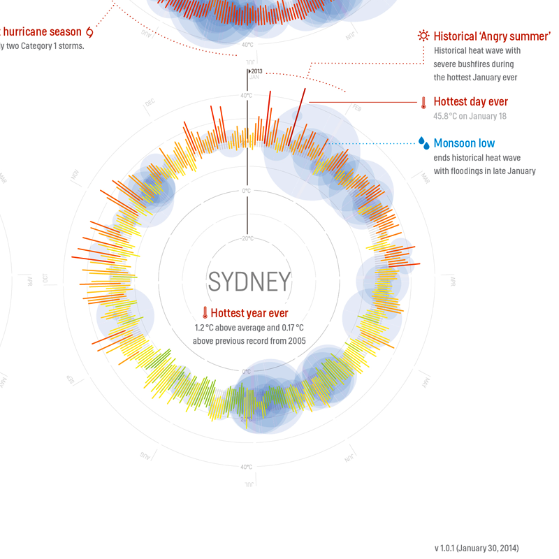
Sydney, Australia
The story behind the poster

The design characteristics
After the runaway success of the Partly Cloudy iOS weather app, we at Raureif created the Weather Radials infographic poster as an analogue companion to the app. In countless iterations, we applied the app’s radial daily forecast visualization to an annual review visualization on the poster.
The resulting design is minimalistic: the colorful infographics consist only of lines and circles, accompanied by carefully considered typography. All elements are arranged on a simple grid, providing visual structure for the poster.
The radial visualizations were created with Processing and then arranged as a poster in InDesign.

The Helsinki font
We think typography is the foundation of great graphic design. That’s why we hand-picked Helsinki™ by award-winning type designer Ludwig Übele to give the Weather Radials poster (and before that, the Partly Cloudy app) a bold, sturdy look.
The data
The data used for the visualization was collected from the Open Weather Map project, the Norwegian Meteorological Institute and Weather Underground. To create the visualizations, we parsed and revised the data to create a set of comprehensive JSON files. The weather events were identified manually from news sources from all over the world.

The authors
The poster was created by German Designer Timm Kekeritz of Raureif. The poster could not have been realized without the help of the entire Raureif team (Jana Kühl, Karen Hentschel, Tobias Ottenweller and managing partner Frank Rausch).
Raureif is an interaction design consultancy. The Berlin offices are headed by Timm Kekeritz and Frank Rausch. Both are renowned software design experts who have been featured in publications around the world. They also teach Graphical User Interfaces in Copenhagen and Potsdam.
Related projects

The Partly Cloudy app
Our first take on weather was the Partly Cloudy iPhone app. Partly Cloudy’s unique clock visualization will show you a weather forecast unlike anything you’ve ever seen before—in a completely intuitive way! You don’t want to waste your time “navigating” a thermometer. That’s why Partly Cloudy is as easy as its analog counterpart: one look and you know what’s going on. Turn the clock hand to jump into the future.
We are proud that our app has won the 2nd Annual Lovie Awards and FWA Mobile of the Day.
http://partlycloudy-app.com

The Virtual Water poster
The Virtual Water poster shows how much freshwater is used to produce selected products—hoping for people to rethink their consumption patterns.
The poster highlights the amount of water consumed in the production of everyday food products.
Based on the study “Water Footprint of Nations” by Hoeckstra et al., German designer Timm Kekeritz created the design in 2007.

The Virtual Water app
Carry the Virtual Water digital companion anywhere and grow more concious about how much water our everyday food and beverages really consume.
The official Virtual Water app is the interactive edition of the popular Water Footprint poster. It has been featured in various books, magazines and newspapers worldwide.
The Virtual Water app provides richer information an even more products than the printed edition—plus full interactivity. Picking a product from the list takes you to its individual infographic: a beautiful illustration and animated water drops.
http://virtualwater.eu